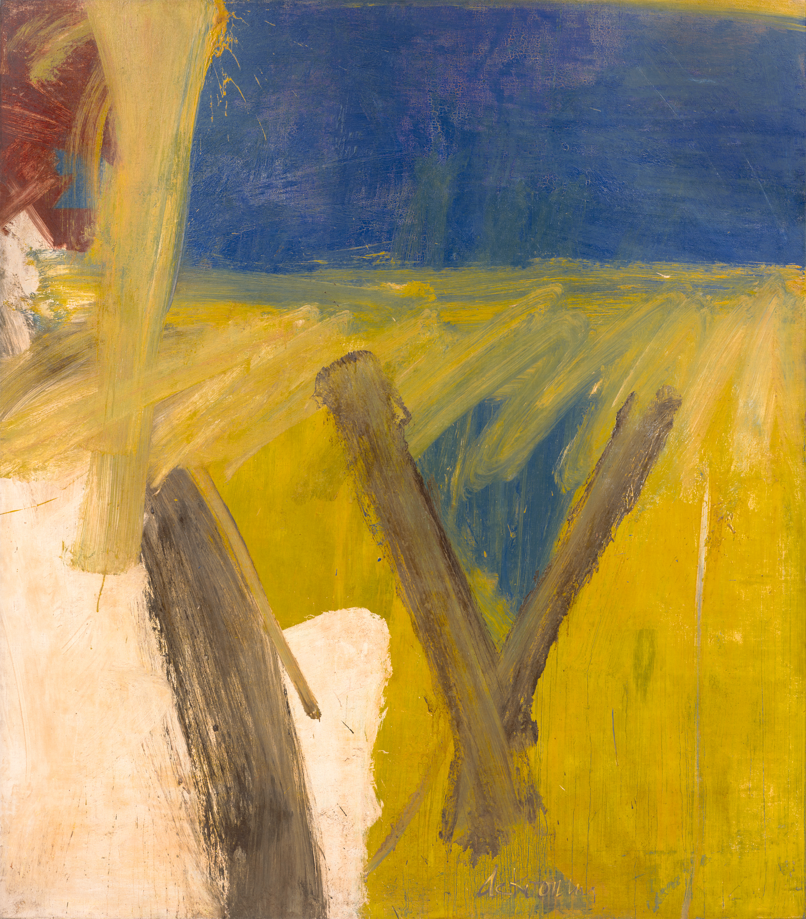
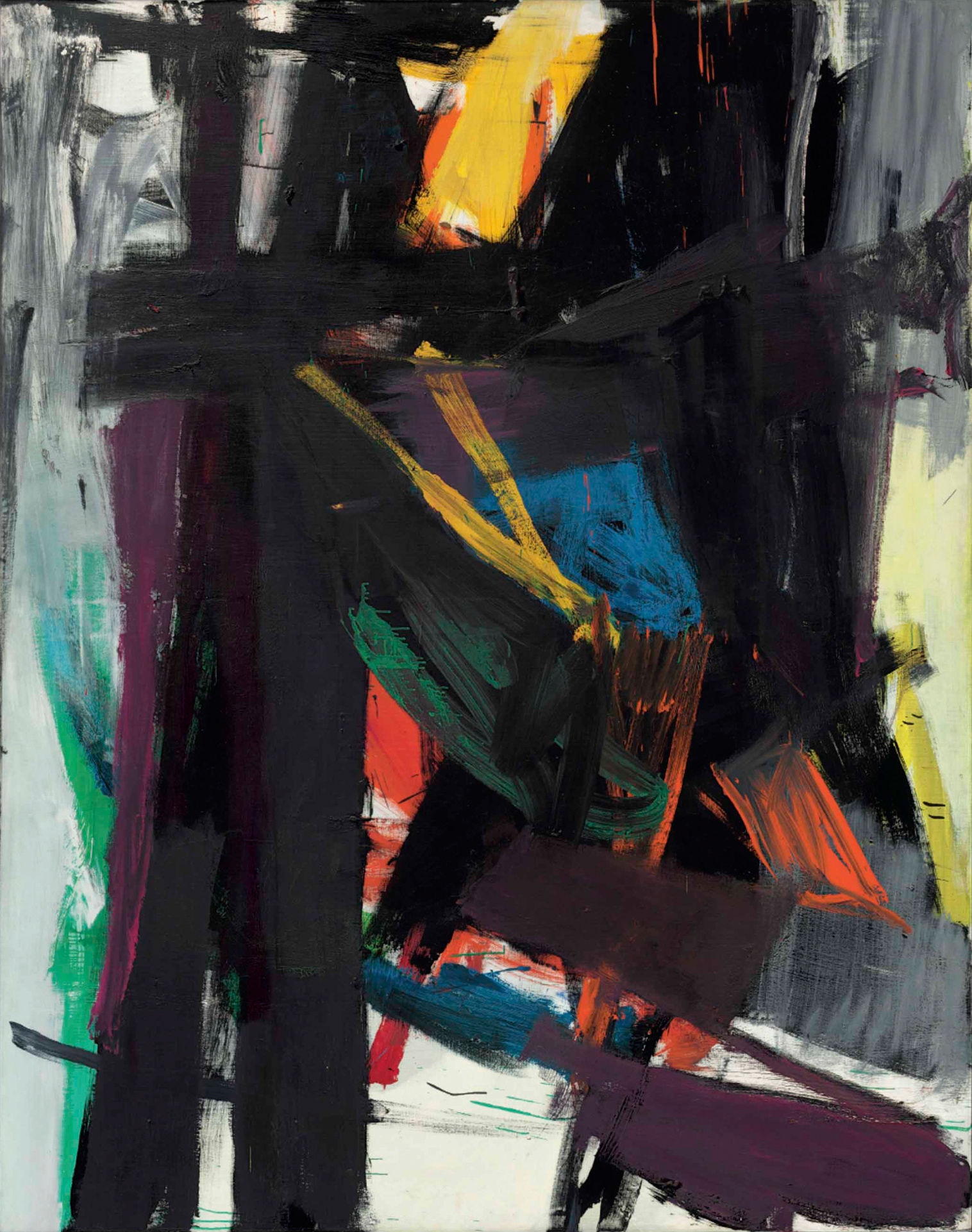
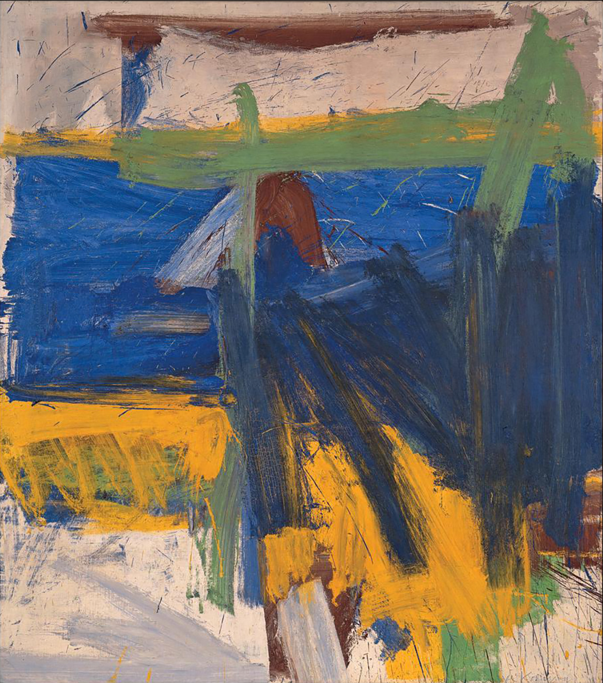
‘Suburb in Havana’ (1958) by Willem de Kooning
Willem de Kooning ’s Suburb in Havana was painted in 1958. The canvas seems to have had its first showing at Sidney Janis’s gallery in New York, part of an exhibition called Eight American Painters that opened on 5 January 1959. Four days before, on New Year’s Day, Fidel Castro’s forces entered Havana. It had been clear for much of 1958 that the Batista regime was falling apart, with street fighting moving in from the suburbs of Havana all through the winter months. The New Year’s Day entry was carefully staged. Press coverage of Castro’s campaign in the US had been overwhelmingly favourable, and stayed so – frightened but thrilled by the imagery of revolution – for much of 1959, certainly for its opening months. Life magazine is a good barometer. Its 12 January issue carried nine pages of pictures under the headline ‘Dynamic Boss Takes Over a US Neighbour.’ On 19 January it had Castro in colour on the cover, with a further spread of photographs inside.
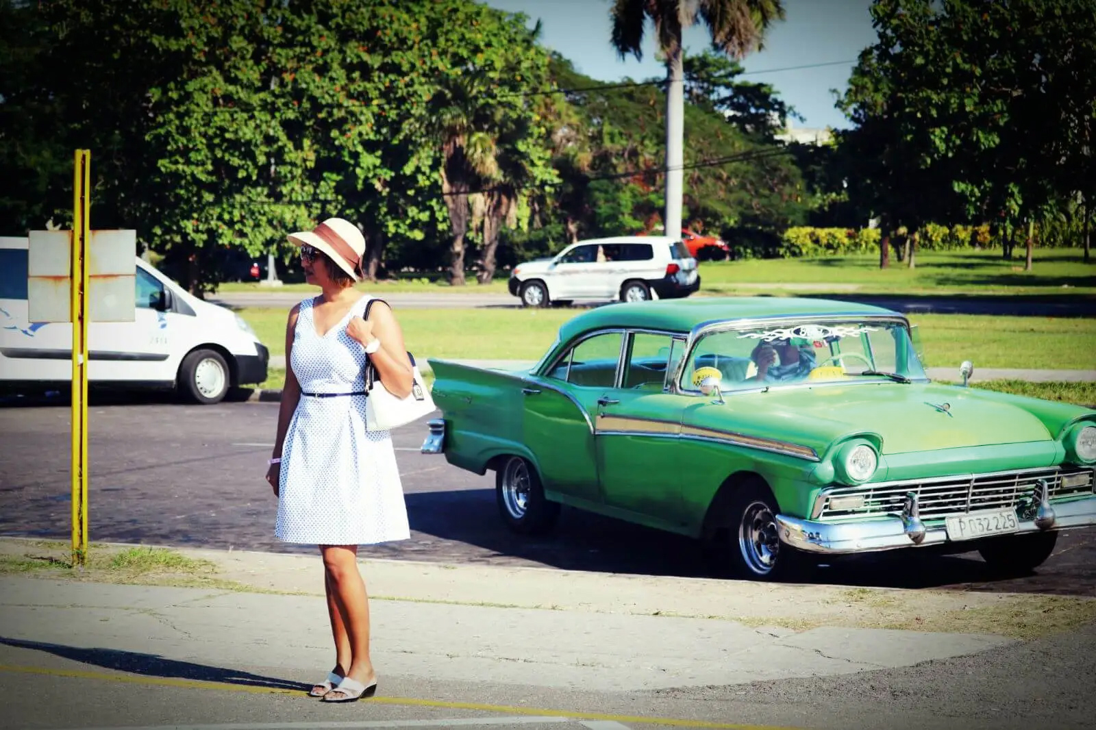
It is painful to return to 1958 at the moment Castro’s regime, after sixty years of resistance, finally faces defeat. These days, a suburb in Havana, if its eyes are on the future, is a stage for models in 1950s costume (as if) strolling by vintage green Fords. Having kept old cars and dresses in good repair for decades of el bloqueo may at last prove a moneymaker. The island is preparing its return to the ‘US sphere’. And perhaps painting and photograph have more in common, judged strictly as responses to history, than most of us would like to believe. De Kooning’s caricature of revolution is certainly a fashion statement. His view of Havana is ‘staged’. But I shall defend it nonetheless.
One way to come to terms with de Kooning’s painting – is it a defence or not? I’m undecided – is to put it firmly back in New York. Art history has decided that 1958 and 1959 are years when the style called ‘Abstract Expressionism’ or ‘action painting’ or the ‘New York School’ grew tired of its triumph and lay down to die. Jasper Johns’s Flag – Abstract Expressionism’s ghastly patriotic shroud – had its first showing at Leo Castelli’s in January 1958. You might say, especially in retrospect, that Flag was always waiting to be draped over Suburb in Havana’s dream of freedom. Flag never grows old.
‘Lay down to die,’ I wrote. But morbidity in modernist art is a necessary condition, and very often horribly lively. Modernism is an art of endings – of art’s ending – and it goes on elaborating its death rattle. De Kooning certainly did. The late 1950s for him were years of elation.
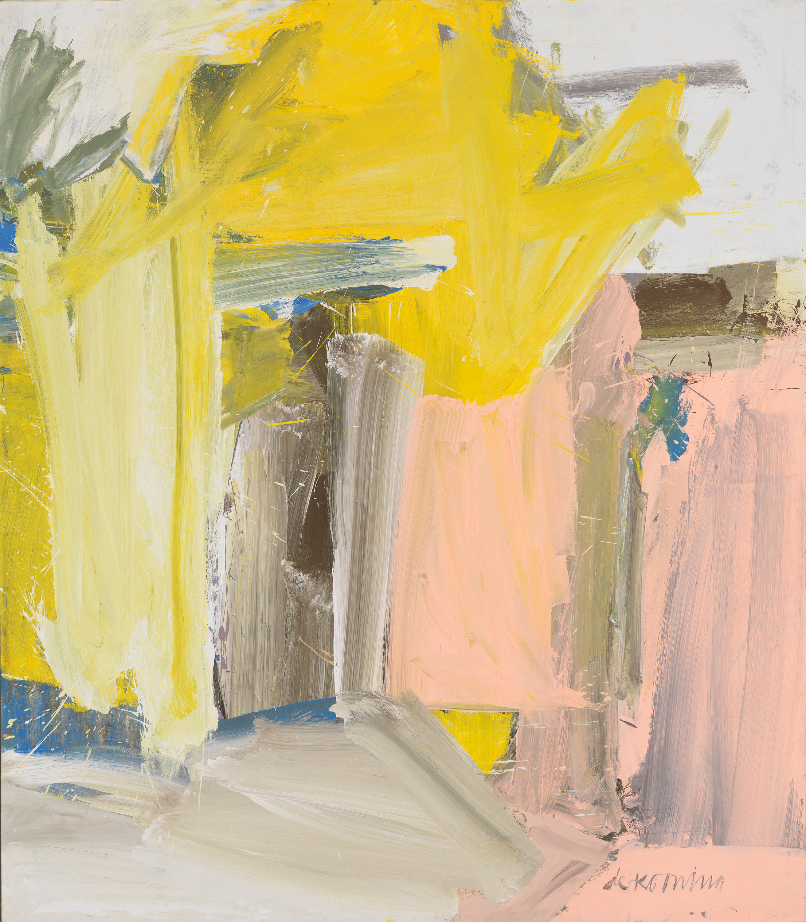
Among the run of paintings from 1958 to 1960, the best companion piece for Suburb in Havana seems to me Merritt Parkway (1959). The two are more or less the same size, eighty inches by seventy. The just-off-the-square format is de Kooning’s default setting through these years, though what he does with it never stands still – compare the even accents, four-squareness and open horizon of Suburb in Havana with the upright velocity of Merritt Parkway. Colour within the series is even more variable, but Suburb in Havana’s yellows and browns stand out from these paintings’ cool, almost pastoral norm. The yellow, especially, is one of the most sober, most qualified primaries de Kooning ever put on. Seen alongside the pastel pinks, pale blues and yellows of so many of its companions (Door to the River, from 1960, is lusher than most, but a fair comparison), Suburb in Havana can look positively grim.
‘Bias Pull’ (1957) by Adolph Gottlieb
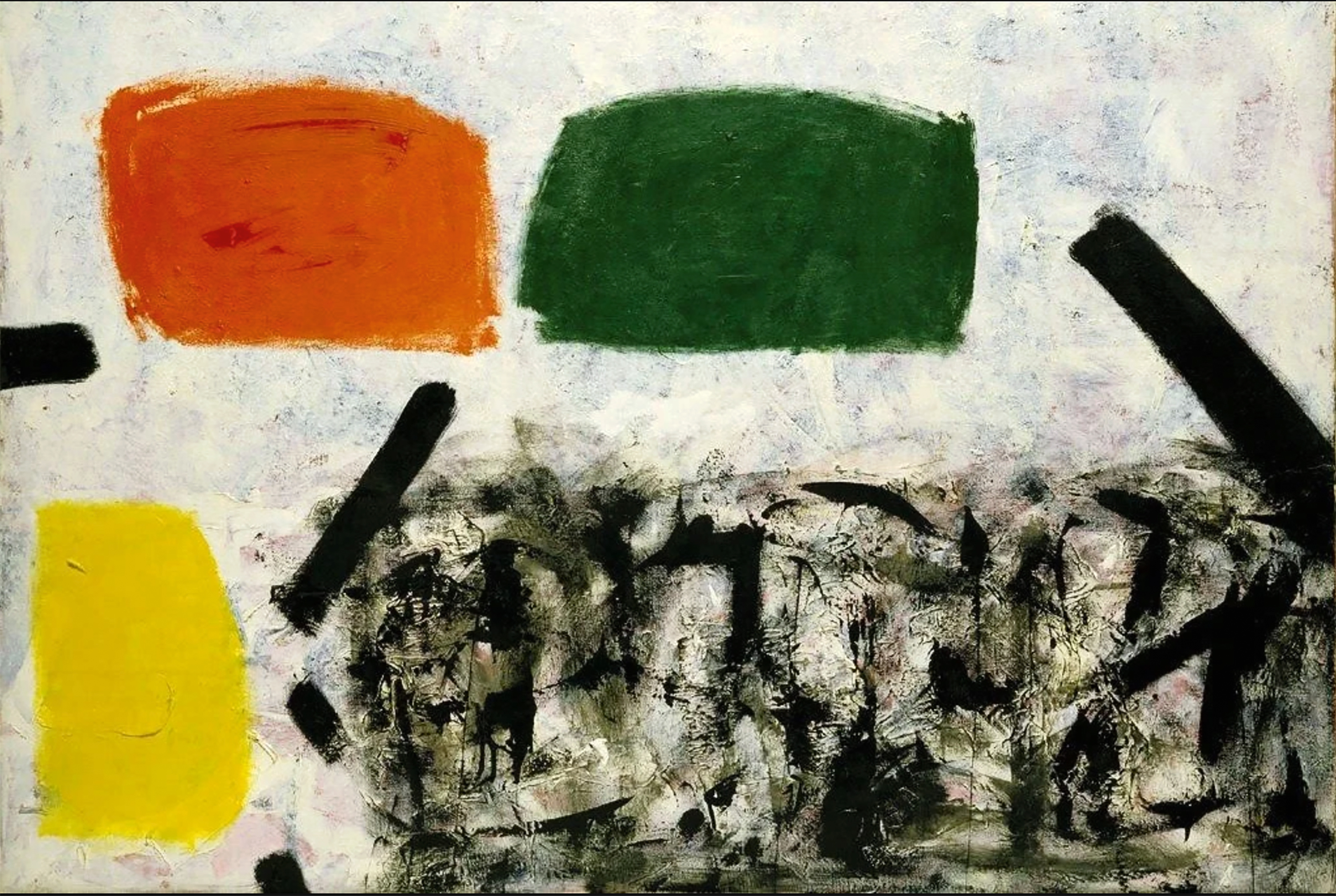
De Kooning’s mood in 1958 was not exceptional. Ebullience was everywhere in New York; Jasper Johns was still an outlier. The old mad master of abstract expressionism, Hans Hofmann, had two successive shows at Sam Kootz’s gallery in 1958 and 1959, first of recent work in high colour, and second of paintings drawn from his long career, the retrospective (selected by Clement Greenberg) opening in the same month as Eight American Painters. Lee Krasner had a show of new paintings, big free-rolling abstracts, at Martha Jackson’s gallery in spring 1958. For most of the 1950s Adolph Gottlieb had been painting his way out of Cubism – its grids and compartments and horizon lines – and in 1957 and 1958, at the Jewish Museum and André Emmerich’s gallery, he showed the results (Greenberg was again curator). No one at the time, or later, quite knew what to do with Gottlieb’s sudden move into Blast and Burst, but one or two earlier paintings in the Jewish Museum show, in particular Bias Pull from 1957, still hovering between landscape and bomb site, may well have struck a chord with de Kooning.
There was one show in 1958 that de Kooning learned from directly – no doubt he had studied its contents for weeks beforehand. In early summer, his friend Franz Kline put up an exhibition of canvases from the previous eighteen months: colour had come back, after years of exclusion, into Kline’s black and white world. There are distinct echoes of the Klines – of his tribute to King Oliver’s syncopation, for example – in Suburb in Havana.
‘King Oliver’ (1958) by Franz Kline
De Kooning, to sum up, was a creature of the New York School. But he was also a naïf, a Great American Artist, a Dutchman looking for his place in art history. Painting Cuba in a time of trouble, Van Gogh’s Wheatfield with Crows had to be contended with, perhaps as it was described in a book by another friend, Meyer Schapiro. (Schapiro’s Van Gogh was published by Abrams in 1950: his description of Wheatfield with Crows has never been bettered.)
Wheatfield with Crows, Cane Field with Revolutionary … Suburb in Havana is a title, not a painting. Sometimes titles matter, sometimes not. In the end, an accounting of Suburb in Havana has to take on the question of its ‘Cuban-ness’, its Fidelismo. It has to reckon with the painting’s superficiality, and to decide if that quality is a strength. But let it be ‘in the end’. Havana in 1958 is a big idea, exotic, abstract, ominous, overdetermined. Thank God there’s a less glamorous circumstance referred to in de Kooning’s title: what we are looking at is a suburb. Stick with that.
Again, it helps to put the painting back in New York. De Kooning had a show at Sidney Janis’s in May 1959, his first one-man appearance for three years. (There is a photograph of Kline and de Kooning outside the opening, an irresistible period piece – brimming with Freud’s ‘honour, power, wealth, fame and the love of women’. And of course the photo speaks to the Kline connection. Kline and the woman on the left with her back to the viewer are Suburb in Havana’s imagined audience.)
Franz Kline, de Kooning and Ruth Kligman outside Sidney Janis’s gallery (1959)
The critic Tom Hess says that Suburb in Havana was in the Janis show, but most probably it wasn’t. His mistake is understandable: the painting would have fitted perfectly in the one-man show. Sidney Tillim counted 21 works when he reviewed the show for Arts in June. Hess said there were 22, including 13 large abstractions. We can be pretty sure, from mentions in the press, plus a surviving photograph taken in the gallery, of the titles of eight of the large abstractions. Merritt Parkway was one, plus Parc Rosenberg, Wall Landscape, September Morn. There was a painting called Ruth’s Zowie. (Ruth Kligman is the woman facing de Kooning and Kline in the photo. She was an Abstract Expressionist painter, and the only passenger to come out alive from Jackson Pollock’s car crash three years earlier. The story goes that ‘Zowie’ was what she said when she first saw the painting in de Kooning’s studio.) Another work in the show was called Lisbeth’s Painting. Fairfield Porter mentions that it ‘incorporates a child’s handprints’: de Kooning had a two-year-old daughter called Lisa. A cluster of works were reproduced in black and white in Hess’s book on de Kooning for the Great American Artists series, which was just about to be published: Bolton Landing, Leaves in Weehawken, Forest of Zogbaum, February. Presumably some of them were there in the show that May.
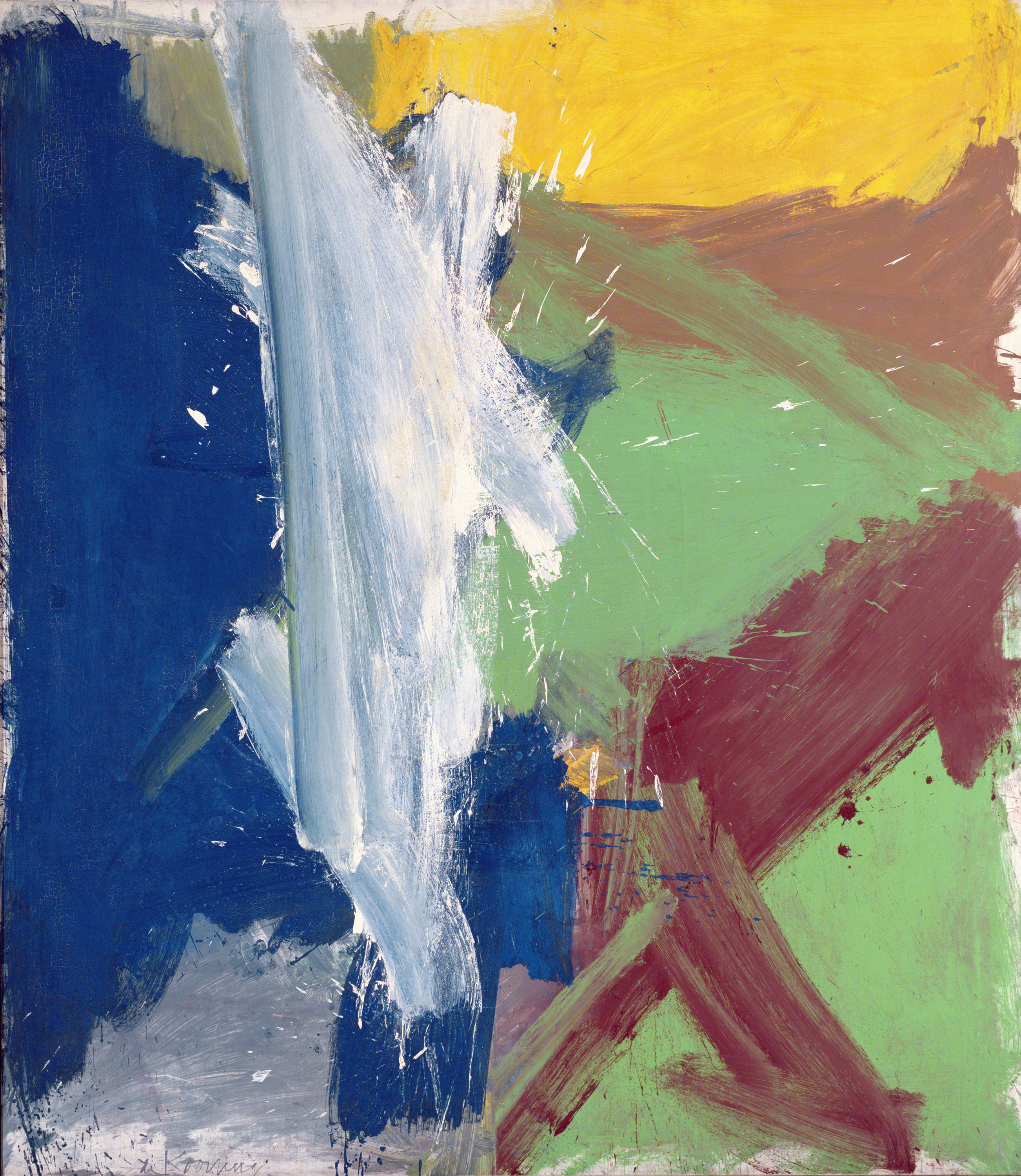
‘Merritt Parkway’ (1959)
I am interested in the fact that so many of the pictures’ titles give strong clues to landscape facts – ‘a chunk of vista ripped from actuality and dumped into a room’, as Hess put it (characteristically) at the time. It’s also interesting that the two reviewers most worth reading in 1959 weren’t much inclined to take the titles at face value. ‘Ruth’s Zowie and Wall Landscape,’ Tillim says in passing, ‘are similarly energetic pastorals’ – similar to Merritt Parkway. Pastoral, maybe, but what Tillim talks about mainly (and doesn’t warm to) is de Kooning’s new formal language: simpler and simpler basic geometry, at war with worked-up ‘expressiveness’. Merritt Parkway would be a case in point:
Despite, or because of, his increasing discomfort with the structural matrix of his style … de Kooning has reduced his pictorial means … There is enough ‘conventional’ de Kooning here to reassure his uncritical admirers (including the collectors who bought out 90 per cent of the exhibition on opening day), but there is an unusual amount of confused de Kooning, torn between his gift for expression and the ‘logic’ of Cubist structure. In the few works where he has achieved a precarious balance, we have the most ‘geometric’ de Kooning to date, camouflaged by the physical wallop of paint application.
Tillim may be under Greenberg’s spell in this – his terms and valuations come from the Greenberg playbook – but that doesn’t mean his criticisms weren’t astute. He had talked already, very usefully, about Kline and Hofmann as de Kooning’s new points of reference.
You’ll gather from Tillim that, by 1959, Abstract Expressionism was beginning to try some people’s patience. The sneer at the 90 per cent collectors is indicative. Morris Louis and Jules Olitski had one-man shows at French & Co that year, with Cubist structure and physical wallops of paint deliberately nowhere to be seen. There was a show of Roy Lichtenstein at Condon Riley in June, still safely Ab Ex. But something was happening. A young man called Frank Stella had a painting in a group show at Tibor de Nagy, made up of ranks of identical black stripes: ‘Like the doors of a big clothes-press,’ as one reviewer put it. It was a dense moment, a discontented moment. Lots of people, not just Lichtenstein, were getting ready to jump ship. Don Judd was polishing his anti-Hessian prose.
A defence of the new de Koonings, then, had better be double-edged. Fairfield Porter’s review in the Nation on 6 June is worth quoting at length. Porter was clever and unpredictable: he’d filled Greenberg’s shoes at the Nation with considerable flair. We know de Kooning thanked Porter for the piece, and you soon see why:
The phrase ‘abstract-expressionist’ is now seen to mean ‘paintings of the school of de Kooning’, who stands out from them as Giotto stood out from his contemporary realists … The paintings are very big, approximately square; or if small, in the same big scale; in very broad strokes of a house painter’s wide brushes, with a dry speed and some spatter … They represent nothing, though landscape, not figures or still life, is suggested. The colours are intense – not ‘bright’, not ‘primary’ – but intensely themselves, as if each colour had been freed to be. The few large strokes, parallel to the frame and at V angles, also have this freed quality. So does the simple organisation, the strange but simple colour, the directions and the identification with speed. And in the same way that the colours are intensely themselves, so is the apparent velocity always exactly believable and appropriate. There is that elementary principle of organisation in any art that nothing gets in anything else’s way, and everything is at its own limit of possibilities. What does this do to the person who looks at the paintings? This: the picture presented of released possibilities, of ordinary qualities existing at their fullest limits and acting harmoniously together – this picture is exalting. That is perhaps the general image. The paintings also remind one of nature, of autumn, say, but autumn essentially, released from the usual sentimental and adventitious load of personal and irrelevant associations. The names of the paintings are misleading (Lisbeth’s Painting, Ruth’s Zowie, September Morn). They are partial, they do not tell all, they do not tell what the painting may have come from (which it may be impossible to verbalise) so much as what the painting partly in each case became.
This is very fine. It says some simple and important things about abstraction, and particularly de Kooning’s version of it. (The fact that Porter was himself an imperturbable figurative painter helped.) I agree about the posteriority of titles, and the need not to take them as indications of what the pictures may be ‘of’. All the same, Porter slightly loads the deck by selecting as two out of his three misleading titles Ruth’s Zowie and Lisbeth’s Painting, which purposely spell out their posteriority. This still leaves us with a cluster of titles taking off from September Morn: Montauk Highway, Leaves in Weehawken, Duck Pond, Merritt Parkway and so on. Suburb in Havana belongs to this cluster. I’m happy with the idea of these names as no more than indicators of ‘what the painting partly in each case became’, but it seems that what they became was enough alike, as a form of experience, for the painter to want to signal the way the what belonged to a special, limited world. Which world, then? What set of experiences?
At one level the answer is obvious, and writers about de Kooning have often had things to say about it. De Kooning himself seemed anxious to help – he came back and back to the topic in interviews and conversations. The difficulty, as I see it, is not in assembling the evidence but in tuning into its tone. It helps, I think, to start from two phrases in Porter: his sense of the paintings’ ‘identification with speed’, and the judgment that follows, ‘in the same way that the colours are intensely themselves, so is the apparent velocity always exactly believable and appropriate.’
Where do speed and velocity lead us? To the most famous thing de Kooning ever said: ‘Content, if you want to say, is a glimpse of something, an encounter, you know, like a flash – it’s very tiny, very tiny, content.’ This has been endlessly quoted in writing on modern art because it sounds somehow deep. But I am not sure de Kooning meant it to be – at least, as applied to the paintings he showed in 1959. (The interview in which he produced the phrase took place the following year, when the landscape abstractions were still under way. The remark was directed in particular to his ‘Woman’ paintings of several years earlier, but the idea of the glimpse is one that de Kooning returns to, and I’m sure it connects with Suburb in Havana.) ‘I still have it now,’ he says, ‘from some fleeting thing – like when one passes something, and it makes an impression.’ Particularly, as he said to anyone who would listen, fleeting things from cars.
Here are the relevant passages – they’re famous, but I do not think we have got them right. To David Sylvester in 1960 (this is a few minutes on in the interview from ‘content is a glimpse’ and I think it takes up the same train of thought):
Most of [my recent pictures] are landscapes and highways and sensations of that, outside the city – with the feeling of going to the city or coming from it, you know. In other words, I’m not a pastoral character, you know, I’m not a – how do you say that? – ‘country dumpling’. I am here and I like it in New York City, but I love to go out in a car. I’m crazy about weekend drives even if I drive in the middle of the week. I’m just crazy about going over the roads and highways … They are really not very pretty, but the big embankments and the shoulders of the roads and the curves are flawless – the lawning of it, the grass. This I don’t particularly like, or dislike, but I wholly approve of it … I mean, I am not undertaking any social … I’m no lover of the new – it’s a personal thing … When I was working on this [Merritt Parkway] picture, this thing came to me: it’s just like the Merritt Parkway.
To the critic Harold Rosenberg in 1972:
There is this strange desire which you can’t explain. Why should you do that? I think I like it because of the ordinariness … The landscapes I made in the 1950s, such as Parc Rosenberg, were the result of associations. But I had a vast area of nature – a highway and the metamorphosis of passing things. A highway, when you sit in a car – removed …
And to Kenneth Snelson and Michael Sonnabend in summer 1959: ‘Just coming around roads, some place, and having sensation of a piece of it, a piece of nature, like a fence, something on the road.’
I do think it is important that the thing about his experience of landscape which de Kooning most wants to get across is its provided nature, its total ordinariness: ‘just coming around roads, some place’; ‘they are really not very pretty, but the big embankments and the shoulders of the roads … This I don’t particularly like, or dislike, but I wholly approve of it.’ The last remark here really is deep, because it’s as close as de Kooning ever came to an ironic reflection on his own class position. I have a hunch that many of the titles were meant to point the same way – not insistently, of course, but sometimes with tongue unmistakeably in cheek. De Kooning did not drive. He was squired up the Merritt Parkway, or along the Palisades, by his friend Wilfrid Zogbaum. Hence Forest of Zogbaum. The Rosenberg in Parc Rosenberg is surely Harold, the only rival to Greenberg as the New York School’s spokesman, and the smart French flavour of the title may be a friendly jab at Rosenberg’s much touted Francophilia. Parc Rosenberg is the most portentous of the landscape series, another back-handed homage to its subject. September Morn is a title seemingly borrowed from a terrible pompier painting, a little girl greeting the end of youth, bought by the Met a year earlier. There had been a song and dance about it in the press. Duck Pond and Leaves in Weehawken and Brown Derby Road, all of them from 1958 or thereabouts, are names that spell out the down home, slightly clunky domesticity of this world almost too broadly. ‘I’m crazy about weekend drives.’
Then there is the matter of the specificity, the localness, of the world on view from the front passenger’s seat. Some readers will be familiar with the basic geography: the roads and small towns just west of the Hudson Palisades, and the longer excursions on Long Island and up into mid-Connecticut. But it is easy to lose hold of the time-frame here. We are not yet in the era of the Eisenhower Interstate – not quite. It’s still the period of the pre and post-war parkways, whose very names conjure up a world of petit-bourgeois optimism and dull decency. We’re still in a Wallace Stevens world, driving on the Merritt Parkway, with its grassy central reservations and gas stations in the middle not at the side of the road, its verges shading off into forest with a gradualness worthy of Capability Brown. You expect to come to the crest of the embankment and see a ha-ha. It’s all poignant and worthy and well behaved. Think of Wilfrid in his Packard heading for the bridge, and Willem looking through the windscreen, ‘just coming around roads, some place, and having the sensation of a piece of it’.
Once the idea of the world seen through a windscreen is established it can creep into actual looking. Take Suburb in Havana. Couldn’t it be the view from the passenger seat? Is that Zogbaum behind the wheel to the left? Are those smears of tropical rain across the glass, about to be cleared by the V of the wiper-blades? Well no, not quite.
What interests me in de Kooning’s view of landscape is the degree to which it knows itself to be generic, and underneath its carapace of wildness to be as decent and limited as they come. De Kooning knew landscape came to him at a distance, in passing, in forms which were neatly contained. We might almost say ‘containerised’. Compare Suburb in Havana with de Kooning’s Netherlands, done for the Container Corporation of America in 1944. Set aside the shock-horror of the contrast – one done for money in a cynically School of Paris mode, the other lunging for the sublime – and ask what they tell us about their maker’s acquaintance with the natural world. ‘I am not a – how do you say that? – “country dumpling”.’ Which is to say, landscape is not anything I know about, or care about much. Seeing it from the car is not essentially different from seeing it in the mind’s eye, made up of clichés of Dutchness. Forest of Zogbaum or Suburb in Havana may be different in temper from Netherlands, but they’re no more optimistic or pessimistic about what modern painting can get from landscape, and use to make a picture. It can get something. Something is probably enough.
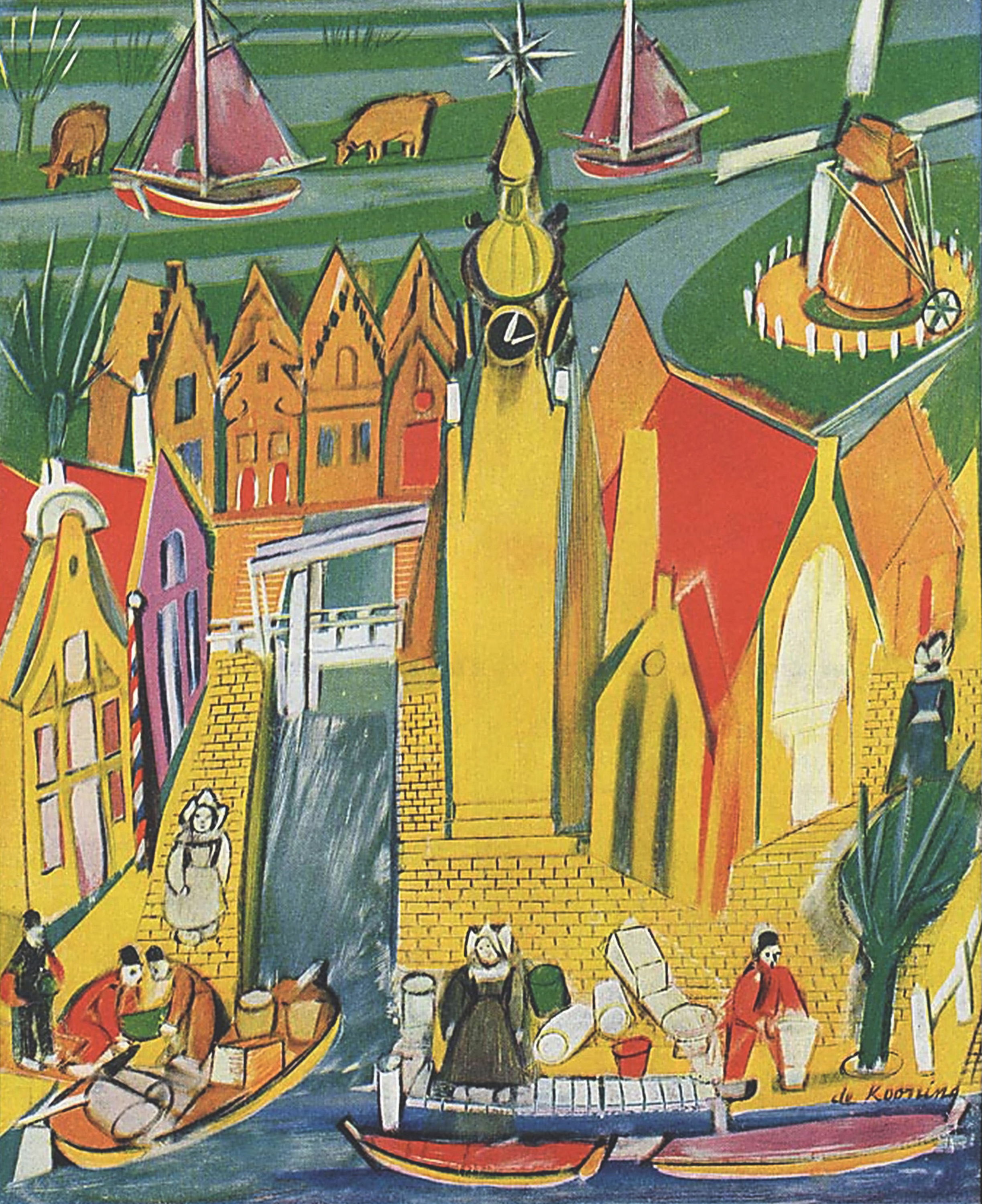
De Kooning’s illustration for the Container Corporation of America (1945)
Of course Havana in 1958 was not the same as Weehawken or the Palisades Parkway. But it was continuous with them. Cuba was where you got to if you plucked up courage and went for a really long drive. It was dangerous and revolutionary and hot. Ernest Hemingway lived there. Maybe you had read The Old Man and the Sea, or seen the movie with Spencer Tracy.
You knew from the papers that Hemingway had a ‘farm’ ten miles or so outside Havana, perched on a hill with a view of the sea one way and San Francisco de Paula the other: Finca Vigía – Lookout Farm – ‘war and revolution do not penetrate here,’ as a hard-working caption had it in 1961. Hard-working because by that time the American press was busy covering the tracks of slightly earlier images of Hemingway in Castro’s company. But set such discomforts aside. In 1958 Finca Vigía was uncontroversial, a place on a tourist’s map. The Carretera Central, running east-west along the island, passed within a hundred yards of the front gate. If you found it, and looked over the wall, you might catch a glimpse of Hemingway with his cats and guns and fighting cocks.
We know that de Kooning (along with Kligman, his companion on the Cuban trip) tried to do the pilgrimage in 1958: years later, talking to the owner of Suburb in Havana, he mentioned being driven through the city looking for the house. The way the retrospect appears in Lee Eastman’s testimony, it’s not clear if de Kooning ever got there. I prefer to think not. I imagine him running a low fever, hating the landscaping on the Carretera Central, unable to decide which was the right big house on the hill. I see him simmering with a mixture – a true petit-bourgeois mixture – of tropical high spirits and tourist ressentiment. The picture done later is part wish fulfilment, part revenge. I’ll give you Hemingway! it says. And it does.
So there are the vectors. Hemingway and Castro, Franz Kline and Spencer Tracy, Meyer Schapiro’s Wheatfield with Crows but also Vincente Minnelli’s (I have no doubt that Lust for Life, which came out in 1956, had de Kooning turning back, partly in exasperation, to the plates in Schapiro’s book). Gottlieb’s Burst and Ruth’s Zowie. Speed and freedom and flawless curves. Palm trees, sugar cane, windmills and little Dutch girls. Avant-garde and kitsch – as always both.
‘Ruth’s Zowie’ (1957)
How do you describe a painting whose points of reference are these? What tone do you adopt? A description of an abstract painting (if it’s any good) surely has to be technical and physical, but at the same time (if these are the painting’s co-ordinates) tour-de-forced. More’s the pity. I prefer Fairfield Porter coolness to Harold Rosenberg bombast; but Porter is too restrained for what he is describing; and bombast of some sort is unavoidable. It had just better be good.
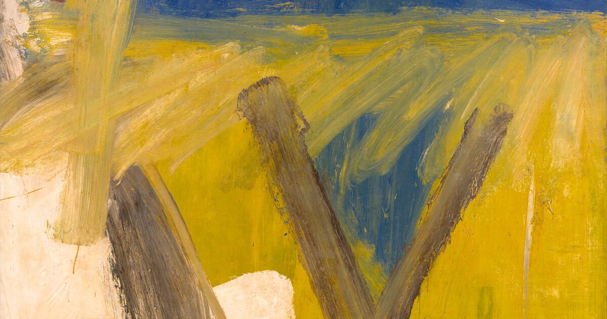
Physical description first. I warn you I shall probably try your patience for the next page or so; but I think that the only way to de Kooning’s intention, which is where I want to end up, is by way of process – by trying to reconstruct the sequence of marks in the case, so as to arrive at an intuition of what the sequence may have been aiming for. I believe Suburb in Havana originally had an off-white ground, maybe with a bit of yellow already worked into it. The big blank area going up from the bottom left corner looks to me like a survival from this first stage. The paint hereabouts is thin enough in places for the canvas grain to show through. Yellow seems to have been the first colour put over the off-white ground – certainly that’s true of the yellow in the picture’s lower reaches. There are several streaks and dollops of blue paint on top of the yellow, which seemingly landed when the yellow was half dry. Obviously de Kooning did not proceed from yellow to blue without looking back. If you focus on the areas where the two colours meet, particularly the painting’s horizon line and the broad yellow scrawl just underneath it, you see straightaway that the blue and yellow were applied alternately – the yellow scrawl has pulled up some blue within it and the horizon line of yellow is transparent to the blue underneath. It looks like the sliver of yellow at the picture’s top right corner was added on top of the blue, though it is hard to say what is going on in this area with any certainty. Clearly, to return to firmer ground, the great vertical stroke of yellow to the left was put down when the blue was already there. You can see spatters of yellow falling across the blue field from the first thick clot of colour at the stroke’s top right. The yellow turns green, quite dramatically, in among the rust brown at the top left corner, and once you notice this, you begin to register how much ‘yellow plus blue equals green’ is happening locally elsewhere, all around the yellow vertical and across the transverse yellow scrawling. This is painting in the wet – it is meant to look liquid, and the paint detail tells you that the look is true to the facts.
What the yellow scrawl is behind and in front of is worth peering at up close, particularly its relation to the various browns. Then you see that the dirty brown stroke on the left-hand side (the one I have already talked about) was originally much longer, going up nearly to the horizon line. The yellow scrawl was put down on top of it, mostly obscuring its top eighteen inches. There is an oddly meticulous liquid straight line, also in brown, drawn at a tangent to the dirty brown stroke’s right edge. I think maybe this was pulled out from the wet paint of the yellow scrawl, and got mixed in with the still wet brown of the stroke it was ruled against, so that it ended up a decided dry brown, stopping on top of what therefore seems a drier white. But again, this is a guess at an enigmatic process.
If the off-white ground was dry when the scrawl was put on (which is what the physics of the tangent line suggest), then there must have been at least two painting sessions to Suburb in Havana, fairly far apart; because the off-white in this area of the picture – to the right of the dirty brown brushstroke – is actually painted on top of the brighter, more opaque yellow. When the scrawl was done, the off-white was dry; therefore the yellow – or some of it – was dry; but the brown was not, and the blue – or some of it – was not. The yellow of the scrawl and the big brown marks look as if they were applied in the same session, at speed. The great brown V is on top of the scrawl, blending with it in places, and also on top of the lower yellow, but not blending with it as far as I can see. My only doubt is whether the blue was involved in this second burst of activity. The more I look, the more I think it wasn’t. So I am changing my mind on ‘alternately’. I think the blue was mostly dry when the yellow scrawl went on. The blue splatters on the yellow to the side of the V – there are one or two distinctly visible to the V’s left – are dry by the time the V gets done. That’s clear from the microstructure. And when I said that the scrawl pulls up blue within it, I was being hasty, or at least approximate. Towards the left it has more traces of brown in it than blue. Obviously the brown was still wet, and the scrawl was out to obliterate it. It is only in and around the V that the scrawl really goes blue. I think quite a lot of the blue paint was dry when the scrawl went on, or almost dry. The blue patch just visible deep behind the rust brown at top left was dry, for sure. It takes no part in the storm of paint marks put on top of it. The blue underneath the yellow horizon line was dry. Some blue gets dislodged – I am not saying the blue was as dry as a bone. You can see some of it smearing up into the yellow at the right edge of the downward yellow slash, and certainly in the scrawl between the arms of the V. But only there.
I warned you I was going to drive you mad! But the point of this blow-by-blow narrative is to get a sense of what de Kooning may have been looking for in the painting’s last stages. Here is my sense of the sequence of events in session two. First the dirty brown smear was put on; then the off-white ground was worked up a little more in response to the dirty brown’s bad manners; then a set of yellow horizontals was established, somewhat dry and streaky, making a horizon. After the yellow horizon line came the yellow scrawl all across it; then maybe the top right yellow flash; then lastly – surely lastly – the great brown V.
So originally, at the end of session one, the blue and yellow must have been much more map-like, almost a satellite photograph, with the blue coming into the yellow like a broad estuary. There would have been no sealing and detaching horizon line at this stage, and of course no great V – no Van Gogh crow flapping its wings over the wheatfield. (De Kooning’s signature is important. It looks as if it was done there and then, in the brown, in the second session – and then touched up with careful dry yellow highlights later. Cheeky!)
In the second session, then, it’s uprightness and forward-looking and landscape-likeness and horizon-ality that get established, on top of the previous map-like abstraction. And also, finally, depth – good old figure-ground, push-pull, Hans-Hofmann-type depth – repoussoir depth – distance magically appearing, framed and pressed back, between the V-for-Victory fingers of the V-for-Van-Gogh.
I am sure, as I said already, that Suburb in Havana intends its viewer to focus on the difference between wet paint and dry. The dramatised difference, I mean. The yellow scrawl is meant to look liquid: liquidity is bound up with fluency and therefore speed. The dirty brown slash, by contrast, is meant to look as dry as they come – obdurately dry, like old faecal matter. Both these episodes were in a sense afterthoughts. It was only on going back to the canvas in session two that de Kooning laid hold of wet versus dry as the main way of organising the war between the painting’s main gestures, and out of that seems to have been generated a parallel spatial dialectic, of uprightness versus map-likeness – or of looking out and across, from Hemingway’s high-perched Vigía, versus flying crow-like over one particular flat field.
‘Door to the River’ (1960)
V equals Vigía, then. The painting is all about wresting a viewpoint, a lookout, from a landscape where you never found one. V equals many other things. It is meant to be monstrously undecidable. It is, for a start, another Door to the River. And like Door to the River, the entrance is sexual. V is for vagina, or Venus as in mons veneris. A vagina put up on a dirty yellow wall with something that looks like faeces. The trick, as usual with de Kooning, is to have this lavatorial subtext be upfront but also invisible. Sex is like that in abstract expressionism – vulgarly flaunted but at the same time sublimated like mad. What gets under your skin about de Kooning’s abstractions, at their best, is exactly the absurdity of their lyricism.
So I guess V is for vulgarity. And for versus, of course. Technical versus. Flatness v. depth, push v. pull, wet v. dry. That is, the brown V literalises (how nice to be able to say that it literally literalises, it turns into a letter) the fulcrum of oppositions that is supposed to make painting under modernist conditions. This, above all, is the masterpiece wager here. But if the V is a letter, then presumably we should read it as the capital V of the first name in de Kooning’s signature just below. So it is V de Kooning, as in V van Gogh. Abstract Expressionist paintings are signatures, essentially, or signatures provided with landscapes to set them off. If the V is for victory, as I am sure it is, then the victory is part political and part artistic. I dare say de Kooning meant his ideal viewer to read the V as that of Castro over Batista – the victory still to come. But of course we were meant to read it as de Kooning’s victory over his fellow Dutchman – that, for him, was always the real civil war. Victory over Van Gogh (and over everybody else, especially Kline, the calligrapher) and yet also of Van Gogh redivivus – the Van Gogh who managed to get out of that damned Wheatfield with Crows. None of this, by the way, cancels the versus. The painting is deeply at odds with everything it cites, including its own manner. The writing on the canvas does not read ‘Versus de Kooning’ for nothing.
‘The Deep’ (1953) by Jackson Pollock
If the conceit of the brown paint as faeces strikes you as too disagreeable (or too predictable) then think of it as pendant to Lisa’s handprints in Lisbeth’s Painting. In both cases Jackson Pollock seems somewhere in the background. A masterpiece of late modernism will naturally have to take on the dead Pollock. I think these paintings try to appropriate his handprints and excretory meandering, and literalise their infantilism.
V therefore certainly means versus Pollock. Versus Pollock’s so-called last painting, The Deep, just as much as versus Van Gogh’s. (Of course it’s worth mentioning that in both cases these were not, so scholars tell us, the last paintings Pollock and Van Gogh did. They are the last paintings the culture industry says they ought to have done.) And therefore de Kooning’s ambition is truly crazy, truly (falsely) suicidal. He will do the painting after the last painting, after Wheatfield with Crows and The Deep. He will do shrieking surfaceness opening onto blue-black negativity – modernist anguish reconciled with the modernist sublime.
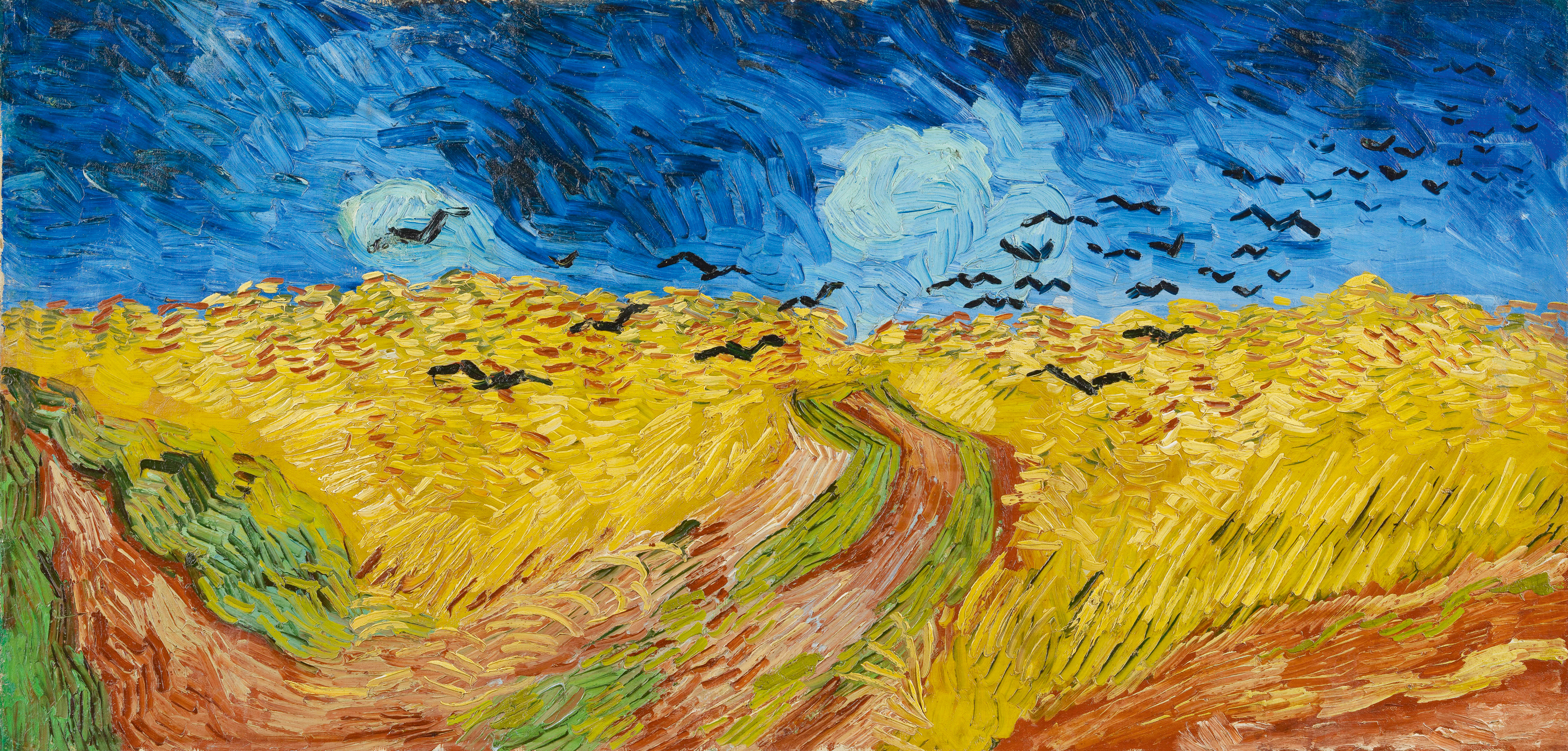
‘Wheatfield with Crows’ (1890) by Van Gogh
It is a mad ambition, as I say, and surely the painting is all about its not being realised. Once you are past the first look of afflatus, Suburb in Havana’s atmosphere is bleak. The yellow is dirty, the shit-smears drab. There is no Deep, and no more forking paths through the harvest. Only this surface v. depth machinery, these levers and wipers, this high-speed efficiency. Speed is not elating in Suburb in Havana. Speed gets you nowhere: it is what painting now has to identify with (pace Porter) just to stay in the game.
The surface v. depth machinery, to say it again, does not deliver the goods. There is no depth in Suburb in Havana, or anyway, no depth that offers itself as a vista – a perspective – a panorama. Just a view out the car window. What the V does not do, spatially, is as important as what it does as pure inscription. It does not recede. Its two strokes do not meet at viewpoint and vanishing point. V, then (and maybe this final negative is at the root of things), does not equal vanishing point. It exactly does not open onto, or back into, infinite space. Let me paint away poor Pollock’s fear of falling, says the picture. Let me lead you away from The Deep. Let me assure you there is nothing, or no nothing, really there.
It is such a typical modernist offer, this one; and, as usual, hard to take up with enthusiasm. For what does modernist painting do, by the look of things, once it averts its eyes from the abyss? What else does it have to paint? ‘You like it under the trees in autumn,’ as Wallace Stevens put it, ‘because everything is half dead.’ Those Leaves in Weehawken, in other words. ‘Just coming around the roads, some place.’ ‘When you sit in a car – removed.’ Sign here, painter. Put it in writing. V for Vincent, V for victory, V for versus. V for modernism’s interminable shuttling between elation and automatism, or fragment and totality. ‘This I don’t particularly like, or dislike, but I wholly approve of it.’
I go on thinking, finally, that modernism of de Kooning’s sort blurted out the secret of its culture. That’s why we hate it so much. Suburb in Havana is a counter-revolutionary painting. Well, of course. It is counter-revolutionary because it is counter everything, versus everything, lost in suburbia. It wants to show us how hard it had to work to get precisely nowhere. Why nowhere was where it wished to get to is a question it leaves to the viewer. Nowhere, alias Suburb in Havana, has many attractions. It is beautiful, colourful, internally coherent. It doesn’t ask its admirers to believe in it. Such a painting simply waits for the moment (which may be now) when its nihilism seems true to life.